The problem
The old site, built on Wix, had been made for a single audience: aid workers and NGOs. It was half in English and half in Italian, with a ten-item menu. Meanwhile Sabrina’s work had changed: one-to-one coaching on burnout and career change, consulting and training for public bodies and companies, a new book on the way. Visitors struggled to tell whether the site was talking to them, and where to begin.
What I built
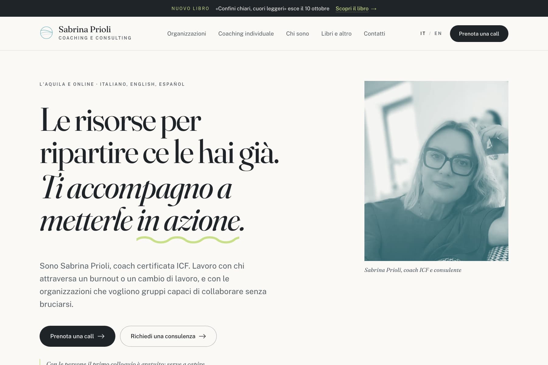
We designed two experiences together, and I built them. The main site has two doors, one for people and one for organisations, and opens on problems rather than services: visitors look for theirs and read, in short, how it will be tackled. Italian and English have pages of their own; certifications, programmes, books and interviews each have their place. «Confini chiari, cuori leggeri» gets a separate site with the book’s own identity: Domitilla Marzuoli’s illustrations to leaf through, a countdown to release day and a sign-up that sends a single email, the day it comes out.
The result
Sabrina has a shop window that matches the work she does today, with two clear paths and the first step always in view: the free first session for people, the consulting request for organisations. The book reaches release day with a site of its own, already gathering the people who want to hear when it’s out — no newsletter, nothing else asked.